How to Create Interactive Financial Charts using Tkinter and Plotly
On This Page
How to Create Interactive Financial Charts using Tkinter and Plotly
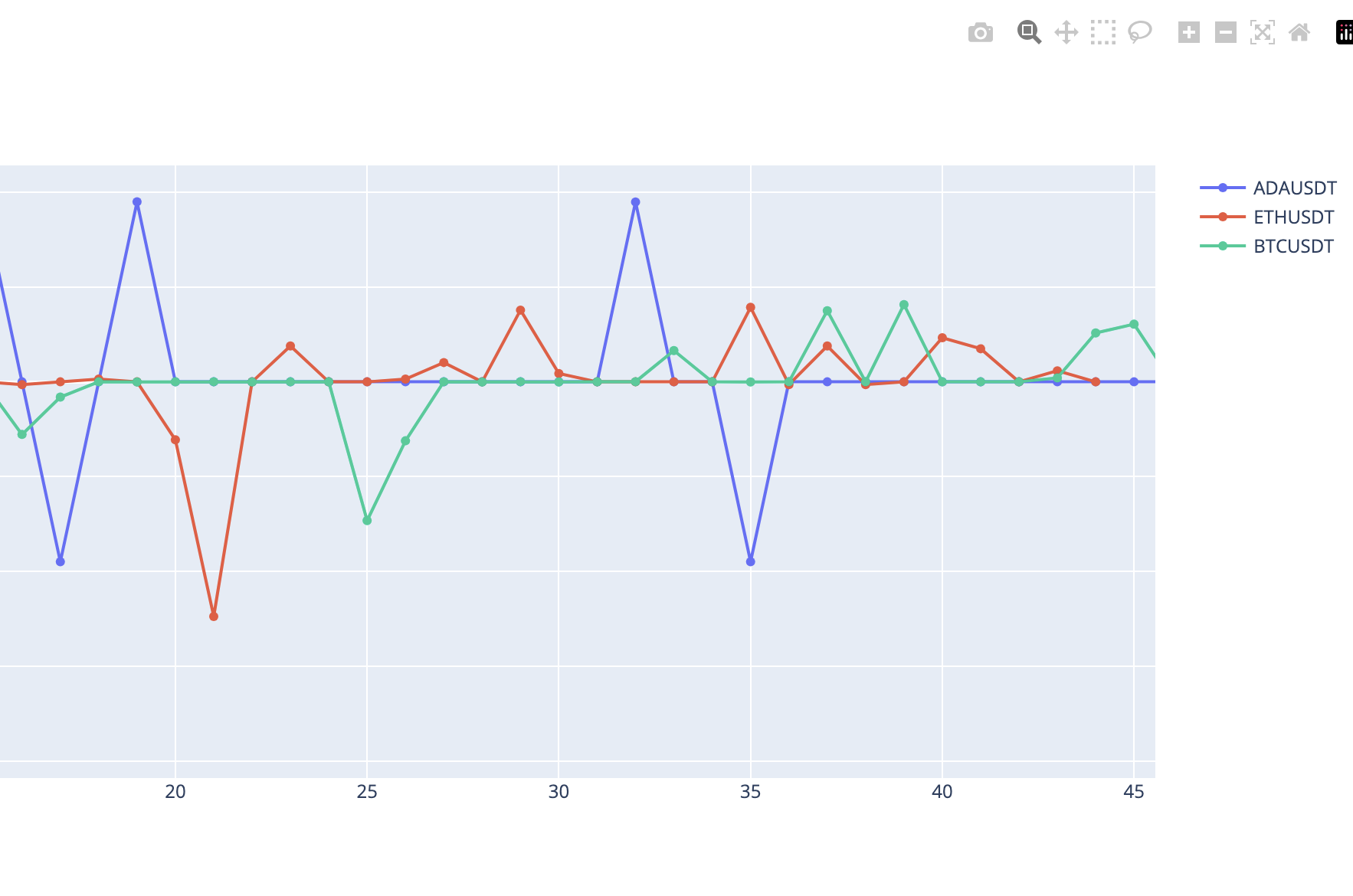
Data visualization is an integral part of data analysis. Python, with its strong set of libraries, has emerged as a go-to language for data visualization. In this tutorial, we will create an application that generates and displays interactive financial charts using Tkinter and Plotly.
Prerequisites
Before we get started, ensure you have the following installed on your machine:
- Python 3.6 or newer
- Dash, Plotly’s Python framework for building analytical web applications.
- Tkinter, Python’s standard GUI package.
You can install Dash using pip:
pip install dash plotly
Step 1: Python Script Imports
import tkinter as tk
import threading
import webbrowser
import random

import plotly.graph_objs as go
import dash_html_components as html

from dash import Dash, dcc
from dash.dependencies import Output, Input
Step 2: Creating a Dash Application Thread
We’ll be running the Dash application in a separate thread. This allows the Tkinter GUI and Dash app to run simultaneously. To do this, we create a new DashThread class that inherits from Python’s threading.Thread:
class DashThread(threading.Thread):
    def __init__(self, data_list):
        threading.Thread.__init__(self)
        self.data_list = data_list

        self.app = Dash(__name__)

        # Initialize an empty graph
        self.app.layout = html.Div(
            [
                dcc.Graph(id="live-graph", animate=True),
                dcc.Interval(
                    id="graph-update",
                    interval=1 * 1000,
                ),
            ]
        )

        @self.app.callback(
            Output("live-graph", "figure"), [Input("graph-update", "n_intervals")]
        )
        def update_graph(n):
            data = [
                go.Scatter(
                    x=list(range(len(self.data_list[symbol]))),
                    y=self.data_list[symbol],
                    mode="lines+markers",
                    name=symbol,
                )
                for symbol in self.data_list.keys()
            ]
            fig = go.Figure(data=data)

            # Update x-axis range to show last 120 data points
            fig.update_xaxes(range=[max(0, n - 120), n])

            return fig

    def run(self):
        self.app.run_server(debug=False)
Step 3: Creating the Main Application Class
The App class will initialize the Tkinter window and generate random prices for each of the financial symbols:
class App:
    def __init__(self, root):
        self.root = root
        self.data_list = {"ETHUSDT": [], "BTCUSD": [], "BNBUSDT": []}

        # Start the Dash application in a separate thread
        dash_thread = DashThread(self.data_list)
        dash_thread.start()

        # Open Dash app in web browser
        webbrowser.open("http://localhost:8050")

        # Start the price generation in tkinter after Dash app is launched
        self.root.after(1000, self.generate_prices)

    def generate_prices(self):
        for symbol in self.data_list.keys():
            new_price = random.randint(1, 100)  # Generate random price
            self.data_list[symbol].append(new_price)  # Store the price in list

        # Schedule the function to run again after 1 second
        self.root.after(1000, self.generate_prices)
Step 4: Running the Application
Finally, we create a Tkinter root window, instantiate the App class, and start the Tkinter event loop:
if __name__ == "__main__":
    root = tk.Tk()
    app = App(root)
    root.mainloop()
Conclusion
You’ve successfully created an application that generates and displays interactive financial charts using Tkinter and Plotly. This project can be extended with real-time data feeds and additional interactive features to fit your needs. Happy coding!